Discover What Makes An Intranet Homepage Successful
Your company’s intranet homepage might be a lot more important than you thought. It greatly influences whether your employees will engage with one another and find reassurance in their company culture and community, or feel disconnected and alienated as they lose contact with their coworkers.
So how do you create an intranet homepage that works? The first thing you need to consider is what you want from your intranet. What are your key goals for your organization as a whole, and for your intranet as a tool to help meet those objectives? The answers will help you determine the shape of your intranet homepage. Keep reading to dive deeper into how you can build an intranet homepage that supports your vision for your organization, and functions flawlessly for your team.
What An Intranet Homepage Does
First, a little background on the intranet homepage. At its core, your intranet homepage exists to support your intranet’s key functions. This includes:
- Connecting the workplace with intelligent search and rich navigation to sites and applications.
- Showcasing news and information to the right people with audience targeting.
- Allowing a user to discover personalized, relevant content from Microsoft 365 and across your digital estate.
- Fostering connections across the organization with social conversations.
- Sharing compelling communications with intelligent video.
- Providing dynamic employee experience that is accessible and available across devices.
What An Intranet Homepage Consists Of:
These are the top elements included in most intranet homepages – what combination you choose and how they’re ordered is up to you:
- Navigation
- Key Tools and Apps
- Key Information
- Community and Culture
- Internal Marketing
- Collaboration
- My Work
Again, your intranet is specific to your organization, so it’s crucial for you to weigh the balance of these elements in your organization to determine what the focus of your intranet should be. In general, you want to strike a balance between content focused on the user, content about the organization, and general findability for your intranet homepage.
- Targeted Content
Your intranet homepage can display information that’s targeted at the user. This includes the tasks, apps the user frequently accesses, and relevant company news.
- Personalized Content
You can display the documents and sites that the user visits in the app bar, and their personal calendar with the ‘my feed’ web part
- Engagement Opportunities
The company’s Yammer feed can be embedded to allow engagement right from the intranet homepage.
- Frequently Needed or Important Content
Any kind of content that is timely or frequently referenced should be included. This is likely the content that users will be seeking when they come to the intranet homepage, so having it accessible here is key for findability.
…And What it Doesn’t Need
It’s also relevant to note what your intranet homepage doesn’t need to consist of. It’s tempting for many stakeholders to include animated carousels of pictures or information or multiple GIFs on the intranet homepage. In our experience (and research backs this up) these types of elements don’t actually contribute to the functionality of your intranet homepage, but make it look busy, confusing, and even frustrating. Needless to say, that’s the exact opposite of what you want! Users are coming to the intranet with a purpose, so you want to think about how you’re going to engage users and empower them to find the information or resources they need to get their work done.
The most important thing to consider with deciding what to include on your intranet homepage is your user. If you don’t understand your users and what they need/want, you’ll never be able to create a successful intranet homepage. We can’t stress this enough – do your homework, and find out!
Examples of Intranet Homepages
The best way to explain what does and doesn’t work for intranet homepages is to evaluate some examples. Here we’ll look at three fully completed homepages and one work-in-progress to demonstrate some key tenets of intranet homepage design.
Example 1: Pulse Intranet Homepage
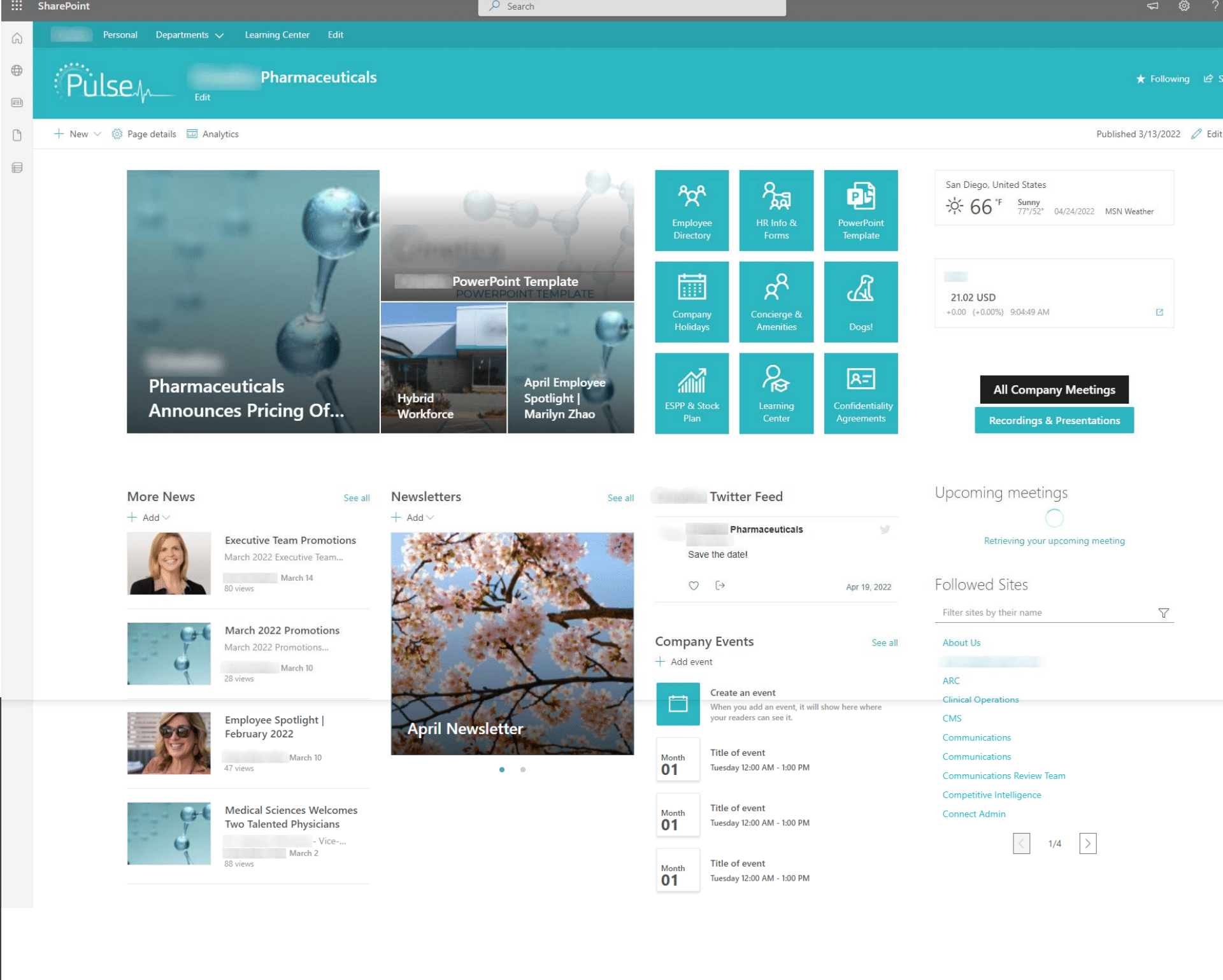
This is a fairly simple out-of-the-box example of an intranet homepage for a pharmaceutical company. We can see that company updates and the company’s stock price are displayed prominently.
 Embrace Company Culture and Have Fun!
Dogs! This company used to feature the staff’s dogs on the homepage of their website. As the company has grown, dogs no longer make sense on the homepage, but they still want to keep part of their company culture alive. The intranet homepage is the perfect place for it.
Choose Your Words Carefully
In this example, there is a section called “More News”. There is no plain “News” section – so why is this designated “More News”? The links above that section include some items that could be news, but they are mostly resources (templates, forms, calendar, etc). This might sound nit-picky, but making things as clear and concise as possible is crucial.
Make Your Intranet Homepage Mobile Friendly
Like many intranet homepages, this one has a three-column layout. Instead of displaying as 3 columns on mobile, everything will be stacked. This means that the “Company Events” section will be all the way at the bottom. Make sure you take mobile into account when you choose your layout and when you place your content.
Institute Governance Around Content Updates
This example includes a “Company Events” section – but there are no company events. Consider what content you want to include and commit to keeping it updated. For example, if you have a “News” section, mandate that new “News” is posted weekly, or even daily.
Example 2: A Non-Profit Organization Intranet Homepage
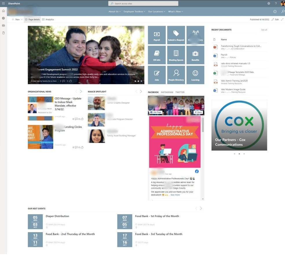
This is another example of a fairly simple layout. This company is a non-profit organization, so instead of stock prices, they’re displaying information about their programs.

How to Use an Intranet Homepage Hero Carousel
We noted earlier that rotating carousels, GIFS, and any other kind of moving element can be distracting or frustrating. It’s hard to tell from the image, but the hero section on this intranet homepage is a rotating carousel of news stories. However, in this example you get an image, the title, a short into, when it was published, and if people are liking or commenting on the post. This may be enough of a hook to get users interested in reading more, or keep watching to see what the next story is. We’d still advise just showing the three stories all at once, but this is a better example of a carousel.
Three Column Layout
Again, this example uses the standard three column layout. This is probably the most common layout, and it allows you to fit a lot of different sections into a relatively small space. But before you embrace the three-section layout, make sure you do really need all those sections. Don’t just add them in to use up space. Something designers always tell us is not to fear white space. In fact, leaving some white space can help your intranet homepage look cleaner and less cluttered, visually giving people space and time to process information. Be really judicial about the sections you think your users really need.
Arrange Information According to Importance
Research shows that most users won’t scroll to the bottom of the page, so make sure you prioritize the most important and most needed resources at the top. In this case, is the blog content being featured up top really the most valuable content to the users? Or are they coming to the intranet homepage for something else?
Don’t Break Patterns (Without a Good Reason)
You want to make your intranet homepage easy to use and navigate. This is a user experience guideline. In general, it’s best not to break consistent patterns that exist across the web when designing your intranet. In this case, the top navigation is centered, when typically, on the internet it’s left justified. If you really want to do something that breaks a pattern, make sure you have a good reason to do so, and make sure you carry out usability testing.
Example 3 – An Intranet Homepage in Progress
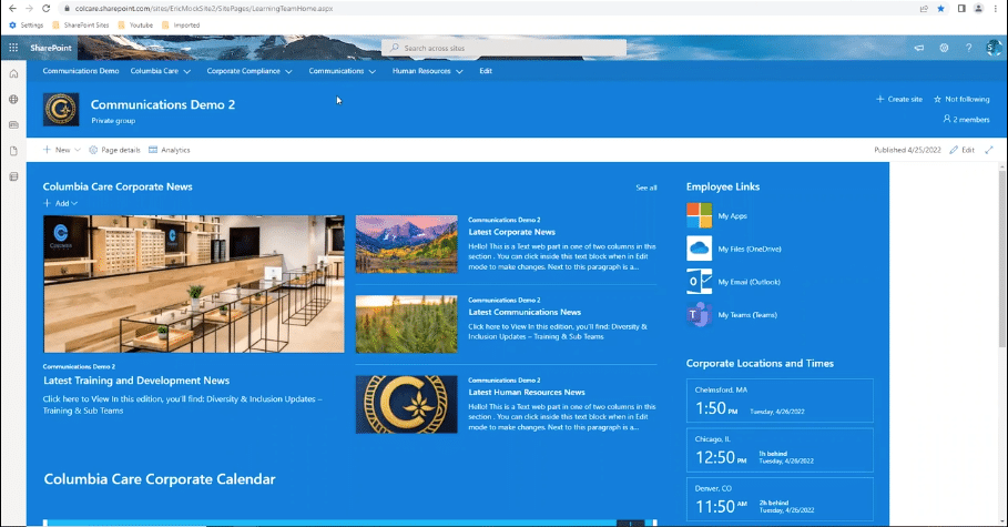
This company is undergoing 2 mergers, and is working to develop a new intranet homepage that meets the needs of all the different stakeholders that are coming together. We took at look at their intranet homepage in progress.
Use Color Strategically
This team has decided they like a blue background for their intranet homepage. We advise you to think carefully before deciding to go full color. It can work, but in most cases, color is better used to highlight or emphasize certain sections. Also, some SharePoint webparts don’t have the option for a colored background, so their white background will stand out awkwardly against the blue. Instead, try using a white background with defined sections, and use color sparingly for greater impact.
Don’t Forget Accessibility
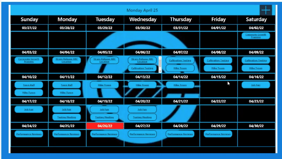
Most people want to include calendars on their intranet homepages, and this team is no exception. They’ve created a custom calendar to be displayed below the news sections. One issue that immediately jumps out is the background design and color – it will make the calendar difficult to read for some users. It’s important to consider accessibility in all aspects of your intranet homepage design, and this calendar would pose a real challenge to anyone with even slightly impaired eyesight. Even if you don’t think there’s anyone in your organization that needs accessibility features, it’s best to include them wherever possible now.
Other Calendar Considerations
Calendars are not the hugest strength of SharePoint. They’re better understood as informational as opposed to actionable. For example, the event list, which is the classic out-of-the-box calendar, allows you see events and add them to your personal calendar. However, it doesn’t sync to your personal calendar, so if the event changes your calendar won’t be updated. Custom calendars are often a better way to achieve what you want from a calendar.
Get the full review and hear more intranet homepages insights from Susan Hanley by watching our free, on-demand webinar!
Ensure Your Intranet Homepage is a Success with Klarinet Solutions!
Klarinet Solutions has the deep experience and expertise needed to help you realize the intranet and intranet homepage that works for your specific organization. We solve everyday technology problems with Microsoft 365, SharePoint, and Intranet solutions that empower employee communication and collaboration. We believe that when employees understand their role and feel connected to their organization, they produce greater results and lead more fulfilled lives. Get in touch today to see how we can help!

